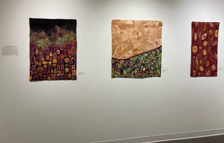
Auditions and Callbacks 2

May 26, 2012

Minimal paralyzing self doubt and hearty spurts of confidence = a good week in the studio!

Late May-callbacks

Late May-callbacks

The Dark Side is taking shape. There will be a gradual subtle ( I hope) dark to light shift across the 7 foot piece and my focus now is on the left/darker side.

The Dark Side in process-detail

The Dark Side in process-detail

A good step, it turned out, was to stop and sort the piles of dyed fabric and felting that I had created. This made the auditions more orderly and less free form. A growing sense of direction emerged and I woke each day with an itch to get into the studio. This is NOT always the case. Big decisions were made. The biggest (and saddest for me) was to accept that that gorgeous pile of golden/ avocado/olive green silks and felting will hardly make an appearance in this piece. I really tried-even to the point of lightly fusing sections down. But it was clear it didn’t work with the bronzy red background. So I set them aside and will find a fantastic use for them in a future piece.


Commission: Auditions and callbacks 1

May 15, 2012

I can be very decisive in many parts of my life but choosing colors is not one of them. I love playing with color, the aha moment when two colors next to each other are perfect and am usually happy with my final decisions. But the process itself can be frought with self doubt and procrastination. It’s like picking my way along a path with constantly branching choices.

Auditioning

Auditioning

For the next many weeks there will be a series of auditions and callbacks. There will be lots of moments when I will feel I’ll never find the exact right color for this part! And with a commission, the clients color preferences further complicates the decision algorithm in my measly brain. It’s a messy business.

But when I find the right color- I feel I’ve decisively figured out the next few steps on this path and for a brief time my confidence and well being is restored!

Callbacks

Callbacks

Till the next color choice…

Show opening fun

May 8, 2012

The opening of the six woman show, Micromorphic, in Woodstock, NY was a blast!. The gallery was packed with lots of interesting folks with great questions and stories (LOTS of stories!).

Viewers at the opening

Viewers at the opening

You can see my work hanging behind the people.

The crowd

The crowd

Curator and painter, Laura Gurton came up with this idea of a show focused on art that somehow was connected to microscopic imagery. The other artists’ work was amazing. It was an honor to have my work hung with theirs.

I especially was drawn to the paintings of fellow presenter Jen Bradford. Gorgeous.

The show will be up at the Byrdcliffe Center for the Arts in Woodstock, NY till June 17th.


Commission: Foundation construction

April 23, 2012

I thought of calling this post “The Unmentionables” because it’s really about how I construct the “foundation garments” so to speak.
After measuring and remeasuring many times, the batting was cut with some extra all around to compensate for the effects of  future dense stitching. A layer of muslin was fused on to keep the texture of the batting (Warm and Natural”) from showing up later. The inner curve was drawn onto the fused muslin the cut made. I did some rough sketching directly on the muslin to orient myself to this 7 foot expanse and then glued on cotton cording to create raised ridges that emphasize key sweeps of line.

batting/muslin with cotton cord

batting/muslin with cotton cord

The background dyed silk charmeuse fabric was then fused onto this base with extra around the edges for later finishing. The richly varigated colors didn’t want to be photograghed so it looks redder than in real life.

With background silk fused on

With background silk fused on

I then stitched along either side of the cording to make those lines sharp.

I should get sponsorship from Pellon because I’ve used over a bolt of Wonder Under fusible web so far on the dyed fabrics for this project!


If you’re in the NYC area…

April 20, 2012

I will have 6 pieces hanging in this show in Woodstock, NY -May 4- June 17. The show is an interesting collection of work by myself and five other artists working in a variety of media who all are somehow inspired by microscopic imagery. Please come if you’re nearby and let me know what you thought of the show!

Micromorphic show

Micromorphic show

Here is the press release with more info:

The Woodstock Byrdcliffe Guild is pleased to announce the upcoming exhibition, Micromorphic, scheduled to be shown at the Kleinert / James Center for the Arts, 36 Tinker Street, Woodstock, May 4, 2012 through June 17, 2012. An opening reception will be held at the Kleinert on Saturday, May 5 – 4 to 6 pm.

Laura Gurton of Woodstock, curator of the all female artist show, paints biomorphic shapes that are reminiscent of life on a molecular level.  Gurton began to seek out other artists, “whose work explores similar shapes and subject matter, wondering what it is that draws them to use and create biomorphic forms.”  Having worked with many mediums and techniques, Gurton is also drawn to investigating how each artist uses her various materials to represent the meeting of art and science in a unique way.  The representation of nature’s beauty in its primary elements can be seen in paint, fabric, digital manipulations, recycled materials, and welded steel.

Participants in the exhibition, which includes Gurton, are: Jen Bradford a painter from Beacon, NY; Jodi Colella, a sculptor from Somerville, MA; Constance Jacobson, a painter and printmaker from Boston, MA; Karen Kamenetzky, a fabric artist from Brattleboro, VT; and Susan Spencer Crowe, a sculptor from Kingston, NY.

Laura Gurton explains, “For each of us, the finished pieces are our own personal statements about our relationships to our materials, our processes and to what we find beautiful and important.  The works of these artists will stir the soul and make us yearn to touch and be part of their work.”

Commission: The design

April 10, 2012

The grand vision for this piece has already gone through several evolutions and I’m sure will go through more in the future. Originally it was going to be about 7+ feet long and about 4 feet high. That seemed daunting to handle and I felt it might look like a block of wallpaper on the curved wall where it will live.

So I proposed splitting it into two horizontal parts:

rough sketch for curved wall 1

rough sketch for curved wall 1

Everyone seemed happy with this, But then I had the brainstorm to make the separation between the two parts a curve that would echo the lines in the piece:

Alternate shape

Alternate shape

I got a thumbs up for that and so submitted a sketch with the new shape:

Design in grayscale

Design in grayscale

This started as a color study-but my pastels and colored pencils ended up looking garish. So I put it into grayscale ( a very useful tool in Photoshop!) and did some photoshop tweeking. This is generally my working sketch at the moment…though the internal elements will morph as I go along.


New large commission-the beginning

April 5, 2012

I’ve gotten the go ahead to start work on a 7 foot long commission and I’m going to attempt to be organized enough to document its creation here. We’ll see…

It will live on a very large curved wall and will be attached with velcro strips (technical challenges are in my future!). I had to rebuild my design wall to accomodate this length and decided to go with gray felt instead of my previous black. This is partly because my studio is one end of our large bedroom and a 12′ black wall seemed a bit goth and gloomy.. Here’s the new design wall/blank canvas:

New design wall

New design wall

I spent some time last week dyeing silk charmeuse and some new alpaca yarn specifically for this commission. I also experimented with Color Magnet while doing this dyeing. Very yummy results. So here’s my palette:

Dyed for commission

Dyed for commission

Next time: the design


Unexpected but fantastic results!

March 18, 2012

A successful dyeing morning with my fiber friend Kris! I’m beginning to dye fabric for a large commission (7 feet long!) and this experiment with using Color Magnet is a part of that.

This product is supposed to create darker areas where applied. I don’t know if it’s because of the material (silk) or the process (acid dyeing uses hot water) but the results were different than expected. But in a wonderful way. Color Magnet is sold in an applicator form as well as the jar of goop.

The applicator went on too thinly so very little patterning happened. The liquid in the jar was fun to apply, went on maybe too thickly, was slow to dry (overnight on my porch wasn’t enough) but gave the best results.

Color Magnet on Charmeuse silk 1

Color Magnet on Charmeuse silk 1

The dark areas are there but also beautifully random white areas.

Color Magnet on Charmeuse silk 2

Color Magnet on Charmeuse silk 2

I love the one above-how the darker areas are outlined in white.
One more:

Color Magnet on Charmeuse silk 3

Color Magnet on Charmeuse silk 3


Color Magnet on silk?

March 17, 2012

I read online about this product by Jacquard and got excited about the possibilities it opens up. You can apply it to fabric anyway you want -then dye- and wherever the Color Magnet was applied attracts more dye. So it creates two tones of the same color.

Yesterday, I drizzled and stamped it  (with wild abandon!) onto a few yards of white silk charmeuse. The stuff is the consistency of honey and doesn’t smell (yay). The yardage is now on my porch drying.

Color Magnet on silk drying

Color Magnet on silk drying

In an hour or so I’ll be dyeing it with acid dyes. Stay tuned for the results!

You Are Here-done

March 8, 2012

It’s been a long process with lots of life distractions but my newest piece, You Are Here, is finished!
You Are Here It’s really a grand experiment in creating with dyed silk gauze – wonderful texture and translucence  but  a bear to handle and sew. But I love the serendipitous results of folding, sewing and ironing. It forms lovely sensuous curves and lines.

You Are Here - detail

You Are Here - detail

That’s some about the technique of creating this but what’s with the name and symbol-y things and color/value shifts?? Well the ideas running through my head had to do with levels of awareness/ confusion/understanding due to proximity/obstacles/light.

What does it evoke for you?


Follow

Get every new post delivered to your Inbox.